I've had to draw over some layouts lately that were scanned in the computer. Now drawing over my pencil line art from Illustrator is one thing. I know where my lines are and if I get confused I can simply place my sketch layers on top of my inking layers so I can see where I am supposed to ink. working with a full blown scan of a sketch is a bit trickier.
One simple solution is to just place the scan on the top layer and place the layer in MULTIPLY mode. After I did that some of the layouts were still hard to work from. Mainly because I had to ink an area black and then draw white computer panels on top of the black lines.
The solution for this, (I'm sure there are many, but this worked the best for me.) was to place the layer in HARD LIGHT mode. You see in Illustrator where it says NORMAL on your LAYER options, just click there and scroll down to HARD LIGHT. I still left this layer on top but it made it easy for me to ink in black on layers under it and still see what I was supposed to be inking. I could also see the areas that needed to be white! That was crucial for what I was doing.
If you want to practice drawing on a tablet or in Illustrator then scan in one of your drawings or someone else's if you want, and do this trick. It sure helped me out a lot for the art I needed to finish.
MULTIPLY generally works well for the same thing. However with having to ink the white areas over black ones this sure helped me a lot. I also did another piece where I made my Perspective lines in red and turned that layer on HARD LIGHT so I could see them on all the layers under this one.
Let me know how it works for you. I'll have some gray tone effect tips as soon as I figure out what I did that made stuff worked. I experimented and got some cool effects. Now I have to go back and try to redo what I did. Oops! I didn't keep notes.
Be well!
Friday, December 16, 2005
Tuesday, November 08, 2005
KILLBOX
 Here's something I'm working on right now. I'm adding extra pages and content to a KILLBOX trade paperback/manga. It should ship in mid-2006. I've been adding gray tones and transparencies to my line art. I'm enjoying the results. What do you think?
Thursday, October 20, 2005
BE BACK SOON
Sorry about the lack of updates to this blog. I've been very busy lately with a number of projects and I have been unable to post anything here. Since I have been working at a furious pace lately I have stumpled over some cool techniques and processes that I will be sharing here soon.
Before the end of 2005 I will start updating again more frequently.
I will be available to answer any questions you have so post them if you got them.
On a side note I have gone back to using Illustrator 10 more. The main reason for this is the Brush tool is very frustrating. I try to draw a circle with the Brush and it comes out deformed looking like a square. I have tweaked all of the tools I know of but nothing helps to rectify el problemo. This kind of sucks because CS2 has so many other cool features, but I can't afford such slow moving or frustrating tools.
Anyway-see you soon!
Brian
Monday, July 25, 2005
SUBTRACT FRONT TOOL
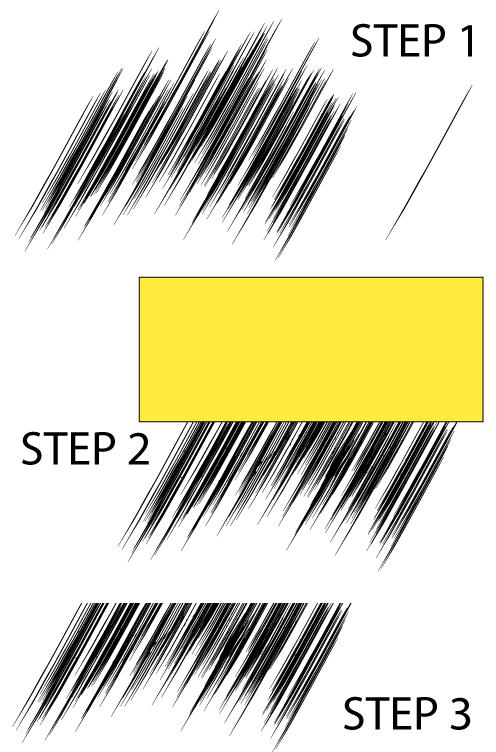 This is a really great way to create rain or power effects or some really cool speed-lines.
Step 1.) Grab a brush with a thick middle and thin edges and quickly touch the screen in a pattern that makes some cool lines like in the picture. Under the Step 1 title you can see what the brush looked like by itself.
Now SELECT them all with the BLACK ARROW(Area Selection Tool.) then go into the MENU bar at the top of the screen and select OBJECT>EXPAND APPEARANCE this converts the brush lines into solid objects that Superman can look through. While you are there in the OBJECT menu go ahead and GROUP the brush lines.
Step 2.) On a new LAYER above the speed lines you just made draw a MARQUEE like the one shown. What we will do here is chop off the top of the speed lines to place them inside a panel.
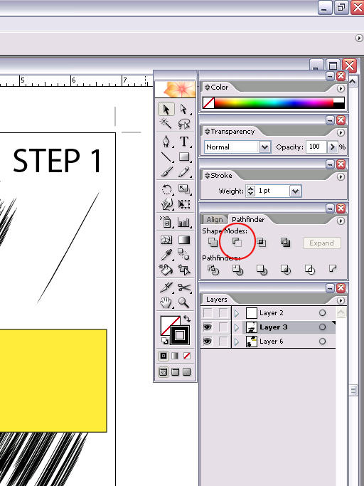
Step 3.) With the ol' Black Arrow select the brush lines and the Marquee and go into the PATHFINDER menu and select SUBTRACT FRONT. This subtracts the shape of the Marquee we made from anything under it, hence the name SUBTRACT FRONT.
Now we have this really cool Speed Line look with a straight edge that we can place against the panels edge.
If you really want to add some sweetness to this effect you can grab the splatter looking default BRUSH and a WHITE STROKE and splatter some white over the tips of the lines. It really looks cool!
Here is a Close-Up of the SUBTRACT FRONT tool in the PATHFINDER PALLETTE. It's the one with the handsome Red Circle surrounding it's little picture. :)
This effect works really well in Illustrator 10 as well as Illustrator CS2.
Sunday, July 24, 2005
I UPGRADED TO ILLUSTRATOR CS2
What a great day. I went out and got the upgrade to illustrator CS2!
I love this program so much. I talked to Todd Macadangdang from Illustrator last year at Comic-Con and told him some of the features I didn't like in Illustrator Creative Suite and how I wouldn't upgrade until some of the functions of some of my favorite tools were fixed. Something they did in CS really bugged me and it made it very difficult to do what I was doing in Illustrator 10.
Man did Adobe really change Illustrator for the better with Creative Suite 2.
Some of my favorite features so far are the ability to save Templates easily, the ability to arrange and save the toolbars to your prefereance, the ability to save brushes quickly and effortlessly. I still have no clue how to do it in Illustrator 10. Now it's a simple button.
I really, REALLy love the Live Paint Bucket tool. If you like coloring anime style you have got to get this program. You can color anime style with a few clicks.
Some features really speed up my drawing time as well. The LIVE PAINT BUCKET feature can fill in ink lines for me very quickly. Some things that would have taken an extra 10 minutes of redrawing can be done now in less than a second.
Don't despair if you don't have CS2 yet. Many of the things I will be talking about can still be done in Illustrator 10. I'll still be thinking with an ILLustrator 10 mind for a while until I learn all the new features.
However some of the new features are easy to learn and very intuitive.
Let me know if you have CS2 yet!
Friday, July 22, 2005
WHO WANTS TO SEE MY "THINGY"
 Here is my finished picture of the ever-lovin' blue-eyed Thing.
I had to get rid of the BRUSH effects on this page because it slowed my computer down to much.
So I went it with the PENCIL and A GRAY FILL and STROKE to make the shading effects.
I did the dark Gray on one layer and the lighter gray on the layer UNDER the dark one. This really gives the impression of smooth shading.
I also created little light grey lines around the shading areas to make it look like I used a real brush and the hairs created some random Happy Accidents. :)
Once I created the black background I saw that the Thing didn't pop out as much as he did against the white background. To correct this I created a small white line around most of his rocky outline. This helps pop him out of the page and away from his background.
I then added white dots to make it look like rocky debris was falling off from him as he moved and the rocks grinded together. That little extra attention to detail really pays off.
IT'S A WHITE THING. YOU WOULDN'T UNDERSTAND.
When I draw an effect that I know will be white I first draw it in a different color. Usually I make it a hot pink or other neon color that I can easily identify on the page.
Once I am happy with the lines I want WHITE I select them and change the FILL and STROKE to white by selecting white in the color picker or by DOUBLE-CLICKING the TOOLBOX colors. This will open a Fly-Away menu box and I select the color from there.
It's a lot easier to do this than to color in white on a white background. That may have been fine in 5th grade art class when you drew a snowman in a snowstorm fighting a Yeti, but it's not a good idea here.
Thursday, July 21, 2005
PAPER BEATS ROCK, BUT ILLUSTRATOR BEATS PAPER
 As I start inking I place my working layers a few layers apart with a bunch of blank layers.
I'll use the blank layers to try stuff out. I'll create new texture effects, brushes if I want to overtax my computer, and I'll create some gray coloring in the middle to see if I want some of my lineart in grey instead of black.
When I choose to create some of my black lines in gray I do so because it really adds some cool visuals and depth to the shot. They are also there as guide notes for the colorist if I have a specfic lighting style in mind.
This shot of the thing has a lot of small details I have added to play up his rocky structure. I notice at this stage that some of the grit looks a little too purposeful. I want more of a random real-world look to his rocks.
So now I'll go in with the pencil and add some white effects. I'll use one of the middle layers and draw some patterns with my PENCIL TOOL set to a WHITE FILL and a WHITE STROKE and a .01 STROKE. With some of my black line-art on a lower layer and some on a top layer this will create some interesting effects.
I'll then place another layer higher than my black line art and do some smaller splattering of white to help break up the rocks.
Friday, July 15, 2005
GET THE LEAD OUT
 Here we have some line art I would use everyday. Some of these lines would be used for hair or bricks or concrete or fabric folds in a g-string, you know, normal comic book stuff.
All of these lines were created using the info I told you in the last step. I have to draw the outline of these shapes with the Pencil Tool in order to achieve this look.
Take a gander at the lower image. These lines are the same as the lines on top, however I gave them an EMPTY FILL with a BLACK STROKE so you can see how sketchy my lines look. After I sketch out my artwork using a NO FILL and a .01 PENCIL TOOL setting I switch to a BLACK FILL and ink the lines.
If you click on this image for a closer look you will see a very pixelated jpeg. These lines are very smooth in Illustrator and just look a little distorted here on Al Gore's internet.
The lines in the middle of the image that look like a real smooth brush are created using a reverse "j" looking line. Anytime you want a Pencil line looking like a brush I have noticed a "j" shape works well to achieve the look.
Why don't I just use a brush? I noticed when I use a ton of brush lines my computer lags. My computer has a 200 gig hard drive and 512 memory. I must upgrade that. But for now the Pencil tool is a cheap alternative to Computer Memory.
"I BROUGHT MY PENCIL" Van Halen

Well looky 'chere. We have finally gotten into the nitty gritty, meat and potatoes Pencil tutorial. The red line is the tracking path of the PENCIL TOOL as I drew the shape below.
I started with this shape as an extreme zoom-in of a small shape that could be used in a brick pattern on a wall, or a sweat bead on a manga character.
The purpose is to demonstrate one small drawback of drawing in Illustrator with the Pencil. You see how a shape that would have been one quick line with a brush has me drawing all the way around the shape to achieve the same effect with the pencil.
It takes a little getting used to, but once you can do this it will really pay off. It shouldn't take more than a day or so to get used to drawing shapes like this and understanding where you need to do it this way and where you don't.
One incredible benefit of Adobe Creative Suite 2's Illustrator is you can use the paint bucket to fill some areas like this very, very quickly. I'm talking Quicksilver fast!
Thursday, July 14, 2005
THE QUICKIE ILLUSTRATOR TUTORIAL
 THE TOOLBOX
The BLACK ARROW--it's not the latest superhero villain from DC COMICS. No! The Black arrow is also known as the AREA SELECTION TOOL. If you drew that red star from the previous lesson you would use this tool to grab the whole star in one mighty click and move it wherever you want to. Or you can draw a big rectangle or square around the star and the Black Arrow will grab the entire thing.
The White Arrow-or as his friends call him behind his back, the DIRECT SELECTION TOOL. If you don't want to move the entire red star from the earlier example but you want to torture the poor star and bend it to your evil will then this is the tool you use. This tool is good at grabbing individual points on the star and moving those specific ones. For instance you can select one corner and pull it into the star until it cries out in pain, "UNCLE!", or you can stretch it in any direction you want. When you click on a side of the star you will notice the WHITE ARROW goes all doppleganger on your ass and becomes the BLACK ARROW. You can then move the whole star.
If you select one point with the white arrow and hold down the shift key you will be able to select multiple points. All of these white points will now be a solid point and will be able to move. All the other points you didn't click will remain in position until you decide to play fair and move them all.
Some of the other tools, in left to right order, are the MAGIC WAND, the DIRECT SELECTION LASSO, (Good at wild keg parties), The PEN TOOL for drawing those crazy Bezier Curves. "Freedom Curves as we call them in the States. You'll also see the TEXT TOOL, LINE, MARQUEE, BRUSH, PENCIL(YEA! Our favorite!).
Also we have the ROTATE, SCALE,WARP which is fun to play with but won't call you back after a one-night stand, and MOVE which um...can move things. Not a great superpower but can always get books down off of high shelves.
SYMBOL which is the little Homie style Spray Can, which I haven't found a good use for as yet, Graph which I would use if I had a "real job" I suppose.
MESH which is cool for tweaking the perspective of Superman's "S" Diamond logo for instance. Gradiant which can do some cool effects especially over a mesh. EYE DROPPER is great for changing the color of items, but one of it's best features is matching text. If you write text one way and do it again in another font and size, but then you decide you want all your text to match you just select the text you want to change and then place the eyedropper over the good text and faster than you can say "Shazam" without looking silly your text changes and it's all the same. Great for comformists conventions. Next is the BLENDING OPTIONS tool.
The 4 colored tools in the middle are from the Plug-ins I mentioned earlier. They are not standard in Illustrator.
The last 4 tools are scary and tell a grim tale. KNIFE, SCISSORS, disembodied HAND, and LOLLYPOP of the damned. Some people think the last one is a MAGNIFYING GLASS but there is no way in Galactus's Shorts you can get me to click the LOLLYPOP of the damned.
The 2 boxes o'color.....ah...we have finally arrived at our destination....The full square box is FILL and it's used to obviously fill a shape with a color. The square donut looking one is our friend STROKE...ah, s t r o k e ...mmmmmm it's nice to think about...Stoke fills the outside of a shape with the selected color, but not the interior which is FILL's job. Fill is union so there is no way that Stroke can do his job. Even though he works harder...alas.
Under that we have the 3 Micro button brothers. First we have COLOR, then Gradiant, then EMPTY. You can click on these for instant access to the selection of your choice.
The 3 buttons below that deal with screen stuff and it's best not to talk about in polite company.
There we have covered the basics. If you have any questions about this stuff please ask below. Some of the tools have fly away boxes that give you more options. Just double Click the tools to reveal if you are a winner.
If we are all buckled in then we can move on to what you've all been waiting for, DRAWING NAKED CHICKS, but before that...let's start with a simple shape or 2 to get you in the mood to use your pencil...um double entendre not intended. Bad spelling not intended either.
COMPOUND SHAPE-Ta-Da!
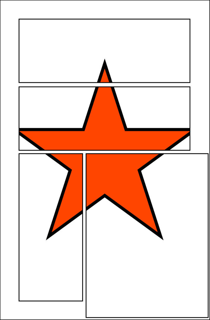 Ta-Da!
It's our new COMPOUND SHAPE! I placed a red star on a lower layer so you can see the magic of the Compound Shape.
Once you create the compound shape the previous 2 seperate layers named PAGE and PANELS now merge into one single layer.
You can rename this layer something dramatic, something silly, or you can keep your stuff well organized and just give it the plain jane monicker GUTTERS.
Place this sucker on the TOP LAYER and don't move it!
Draw everything in the panels on the layers below it. You can sperate your art into seperate panel layers if the mood strikes you.
If you are into a goth book, or want your stuff to look like Ultimates you can fill your GUTTER with a BLACK FILL and BLACK STROKE. To do this just touch the Compound Shape with your Area Selection Tool, the black arrow at the left corner of your TOOLBOX. The set the Fill and Stroke to black.
I have this Compound Shape set to a WHITE FILL and a 1point STROKE.
What's that? You don't know what the heck I am talking about? You are new to Illustrator you say? Allrighty then, next lesson--the Quickie Illustrator tutorial
CREATING PANELS
 Once you have your document open and you are ready to start drawing comics you'll need to decide on a panel layout that best serves your page and story.
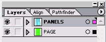
Create a layer called PAGE and another layer on top of that one called panels. The PAGE frame should be as big as your page. (Remember the red outline from the previous step?) The layer named PANELS should contain the shapes of the panels you'll want for your story.
Once the PANELS layer is on top of the PAGE layer you'll need to go up to the MENU bar and select OBJECT>COMPOUND PATH>MAKE to create a compound path.
A Compound Path is basically a stencil shape that will overlap the artwork. Where the holes exist in the stencil we will create our art on underlying layers.
Once the Compound Path is created we will color it with a WHITE FILL and BLACK STROKE or a BLACK FILL and BLACK STROKE.
Now that we have our page setup we are ready to start drawing our comic art. If at any point you want to change your COMPOUND PATH you can go back up into OBJECT>COMPOUND PATH>RELEASE and this will turn it back into the panel frames. They will keep the same colors so you'll need to select them carefully to change.
Another way you can change your COMPOUND SHAPE is to use the DIRECT SELECTION (The White Arrow tool at the top Right of your TOOLBOX.) and select specific points (Corners) to move that into the shapes you need.
PAGE TEMPLATE

Let's get started! You will need to create a new file. To do this go into FILE>NEW and this will open the dialogue box you see to the right.
Rename the new document as I have it here, Comic_Page_Template or another exciting title you provide on your own. :)
I have the settings set to pixel for any international viewers of this page who decide not to use the Inches menu.
Pixel is understood the world over.
Once your document is open make one layer that you will keep on the bottom. Draw 3 boxes as I have done in this picture at these exact sizes. You can use the MARQUEE TOOL to create the shapes. Once you select Marquee just click once in the center of your picture. Another dialogue will open and you can type in the exact dimensions of your boxes.
It beats trying to do it manually. That'll drive you crazy!
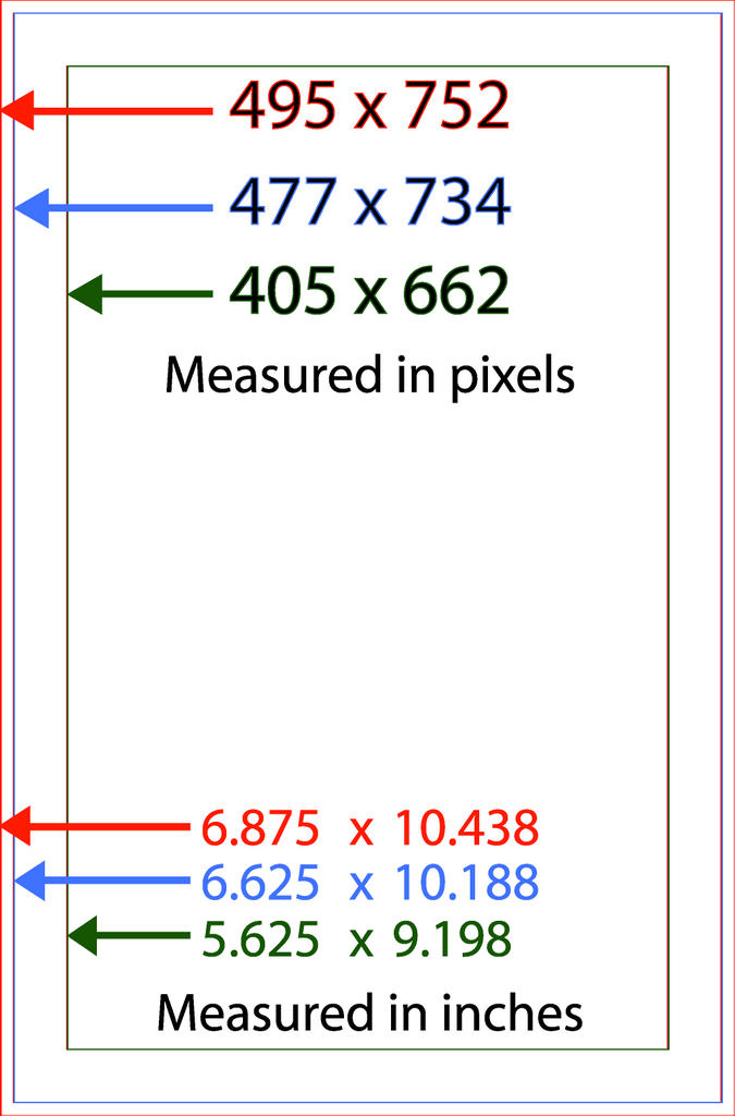
Here are the exact dimensions I use for my page template. The RED BOX is the TRIM area once your art is printed. Anything between RED and BLUE may be cut off during printing.
The blue are will contain your artwork. The inner GREEN box is a lettering guide. No lettering should go outside of this box. It will look very unprofessional if it does.
Click on my image of the page template and it will open a bigger image. Save that one to your computer and place it in Illustrator and you can see if your lines line up with mine.
I keep 2 layers in my LAYER PALETTE with these guides. One is one the very bottom at all times. The other is on the very top. All of my artwork is contained on LAYERS between these 2 layers as I draw. Once I know that my art is within these guidelines I will delete those layers and continue finishing my art.
Always delete them before printing your image or sending your work to your publisher. You don't want a green box showing up over your beautiful artwork.
Wednesday, July 13, 2005
DESKTOP
 Once a file is opened my screen looks like this. All of my tools are on the right side of my screen.
I work on a PC and keep my DESKTOP TASKBAR on the right side of the screen in a vertical manner.
The blue in this picture represents the space of the Taskbar. It's hidden in this image however.
This setup is very functional for me because everything I need is on the right side of the screen. I don't have to stretch my right arm across the left side of my tablet to get to any menu.
Another benefit of this layout to me is that I can see the names of the open WINDOWS I have on the right side TASKBAR in windows. I think I can read the titles to 15 seperate WINDOWS in this manner.
MY SETUP

Setting up the TOOL PALETTES in this manner is very efficient for me. All of the tools that I need are indicated in this picture.
On Top is the STROKE palette all by itself. I usually keep the Stroke weight to .01 but I do change it when I need a thicker line.
Under that is the COLOR and TRANSPARENCY palettes. I find I need these a lot so I keep them out where I can get to them.
Next is LAYERS which I use a lot. Docked within that window are the ALIGN and PATHFINDER palettes. I don't use these as much but I do want them out where I can get to them as fast as I can.
All of these palettes are docked next to each other on the left side of my screen. I keep the TOOLS menu on this side as well because it's just a quick slide to the right side of the tablet and I can access all of the tools and menus in Illustrator that I need.
Notice in my TOOL BAR the little colored tools in the middle. These are Plug-Ins I got for Illustrator 10 a while back. Here is a link to the XTREAM plug-in page. http://www.cvalley.com/
1st Step-THE PENCIL TOOL
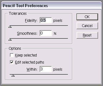 The very first thing you must do in order to draw comics in Illustrator is to change the PENCIL TOOL settings.
The default Pencil is nearly impossible to draw with. It's even worse to try and draw fast with and fast is the name of the game when drawing comics.
DOUBLE CLICK the PENCIL TOOL icon in your tool pallette.
A fly away menu will open and give you some settings to play with that look like this picture.
The .05 FIDELITY and 0% SMOOTHNESS settings are what I have found work best for me. Play around with them and draw with the PENCIL until you find what works for you.
It is Imperative to click the KEEP SELECTED option OFF. If you keep this box checked it's very hard to draw with the Pencil tool to mimic a real pencil.
If you draw with the Pencil Tool and the Keep Selected button on then the computer erases each line you draw as you draw a new one.
I rarely use the PEN tool at all to draw in Illustrator. I find the Pencil tool does what I need and it's a lot faster than the Pen tool.
Monday, January 31, 2005
WELCOME TO ILLCRAFT!
EDITED--July 13, 2005
I decided to delete the blog, which was just pictures of my art, and rededicate it to teaching everything I have learned by drawing comic books in Adobe Illustrator.
You can still find my artwork online at www.briandenham.com if you want to see my finished art. It's a little more organized than ILLCRAFT was. It's also easier for people looking for my art to find it there rather than hunting for this site.
In the last year I have been in contact with lots of artists, fans and curious students as to how I am drawing in Illustrator. I have posted on many different websites and message boards some of my more helpful tips. I think it would be a lot better for everyone to just point people to this site where I will post all of the tips and tricks I have come up with. That way everyone who wants the information can get ALL of it here, and I don't have to keep answering the same questions on different message boards.
I think this will work a lot better. I'm excited about the change and getting a little more organized with my blogs.
Hope to see you around...
~Brian Denham
I decided to delete the blog, which was just pictures of my art, and rededicate it to teaching everything I have learned by drawing comic books in Adobe Illustrator.
You can still find my artwork online at www.briandenham.com if you want to see my finished art. It's a little more organized than ILLCRAFT was. It's also easier for people looking for my art to find it there rather than hunting for this site.
In the last year I have been in contact with lots of artists, fans and curious students as to how I am drawing in Illustrator. I have posted on many different websites and message boards some of my more helpful tips. I think it would be a lot better for everyone to just point people to this site where I will post all of the tips and tricks I have come up with. That way everyone who wants the information can get ALL of it here, and I don't have to keep answering the same questions on different message boards.
I think this will work a lot better. I'm excited about the change and getting a little more organized with my blogs.
- http://illcraft.com/ This blog will be used for instructing people on how I am using Adobe Illustrator to create comicbook art.
- www.briandenham.com My online portfolio. I'll post all of my artwork here. Most of the art here is either all-ages or teen and up.
Hope to see you around...
~Brian Denham
Subscribe to:
Posts (Atom)